Role: tenured content designer for Capital One
Site: The Exchange, Capital One’s internal self-service platform for data
Hard skills: wireframing and prototyping with Figma; content writing and editing; information architecture, hierarchy and taxonomy; research, testing, and iterative design; product design; data design
Soft skills: strategic thinking; communication; upward management; getting stakeholder buy-in; presenting to clients
Situation
Every year, the CEO of Capital One addresses tens of thousands of employees in an all-hands that sets the company’s strategic imperatives. In 2023, Capital One was all-in on improving data quality. That’s where The Exchange—Capital One’s self-service platform for data—comes in.
Those Capital One employees use The Exchange in their daily roles to publish, discover, access, and govern data in all forms and across its value lifecycle, empowering the company to create amazing, well-managed, data-driven customer experiences.
Task
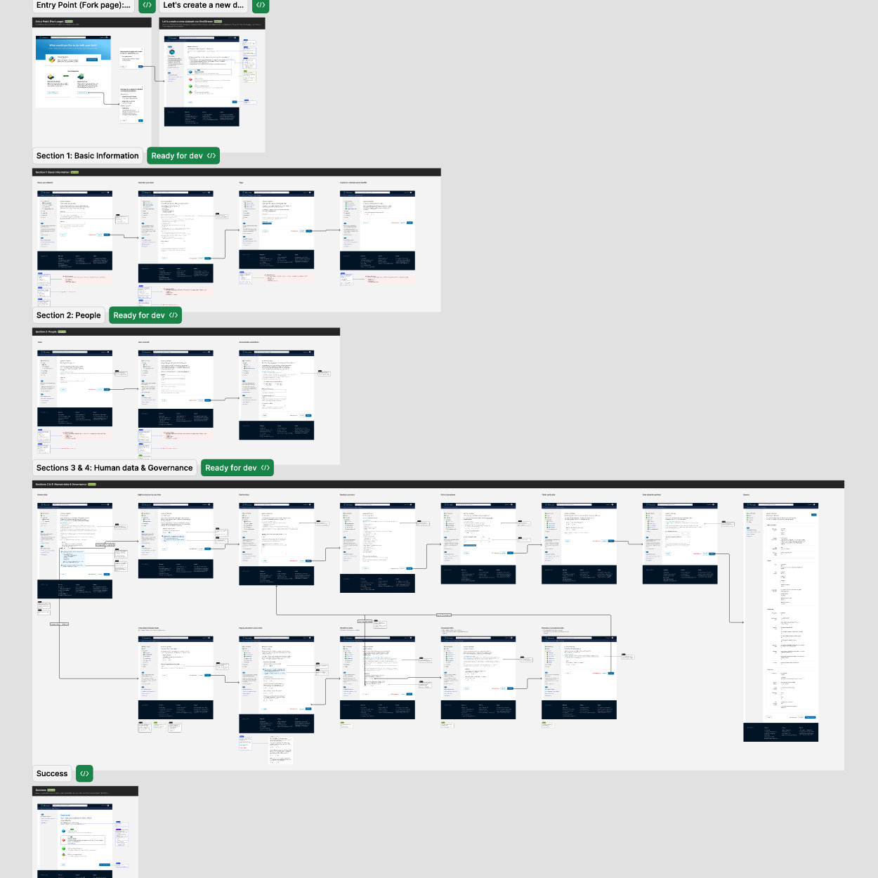
My design team joined product and tech teams on a project to overhaul The Exchange’s data-publishing experiences. As a content designer, I was paired with a more junior UX/UI designer.
When we began the project we examined complex, dynamic, multi-step forms that provide users with a lot of assistive text, such as Turbotax and D&D Beyond character creation flows. We also used user research to revamp unclear error messages and focus on pain points.
Action
My design team regrouped questions so that they were organized by how a user would understand them, not by stakeholder org charts and internal silos.
We presented two options to stakeholders, with pros and cons for both of the redesigned information architectures: fewer, longer pages or many shorter pages.
My UX/UI designer and I collaborated daily with Figma working sessions, and our larger P/D/T team held weekly P/D/T check-ins.
Results
VP-level stakeholders from product, tech, design, and legal ultimately took my content design recommendation to use shorter pages. This design…
- lowered the rate of error occurrences by about 20%, and provided clearer next steps when an error was triggered
- eased the user’s cognitive load
- improved wayfinding and progress-tracking
- improved the user’s momentum and cut turnaround times on this form in half, from about 20 minutes to 10 minutes
- allowed users to save their progress and return later
- reduced technical debt, in anticipation of additional questions that other lines of business would add to this user flow